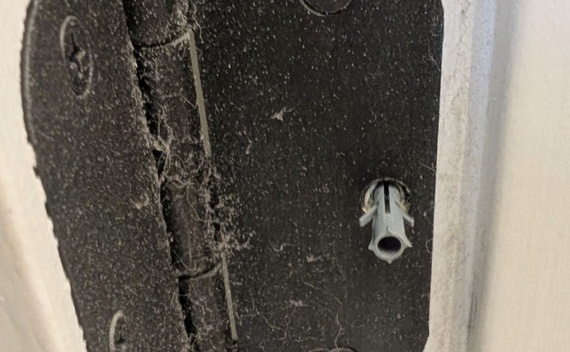
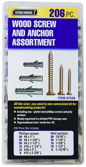
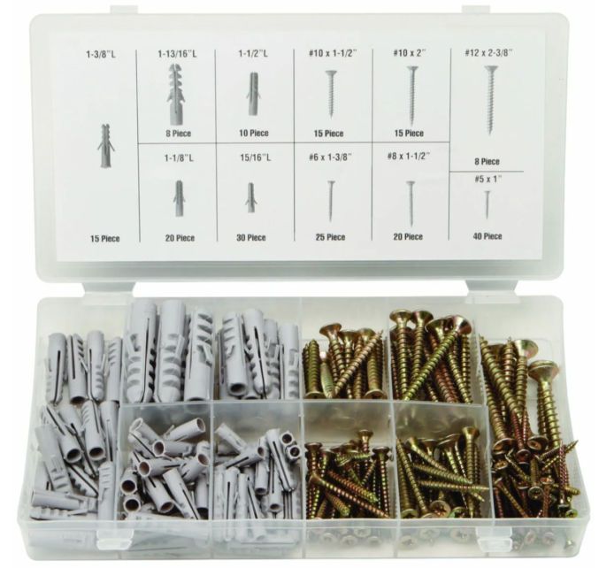
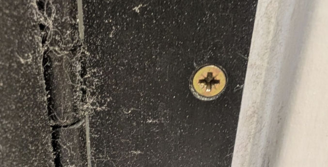
If you have a loose screw that just keeps turning when it’s fully inserted, some sources indicate you can stuff one or two zip ties in a screw hole before screwing the screw to fix that. I’ve tried that, but it only works occasionally. I’ve also tried the Screw-it-Again wood anchors, but those are no better. What actually works are these plastic anchors at Harbor Freight.
They are cheap and work consistently. Here’s how to use them. For standard residential door hinges, choose the smallest anchor (15/16″ long”) and the #8 x 1-1/2″ screw. You can also just reuse the screw that came with the hinge.
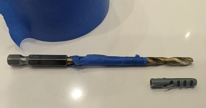
Wrap a piece of painter’s tape around a 3/16″ wood drill bit the length of the anchor from the tip so you know how far to drill without drilling longer than the length of the anchor.
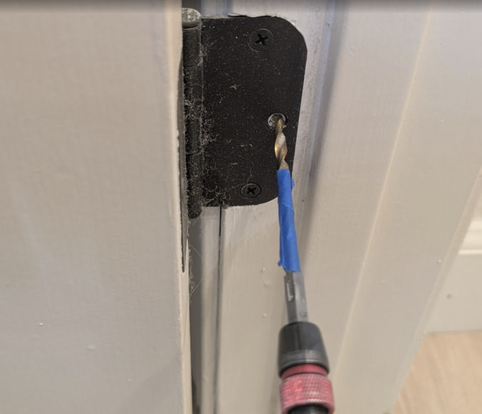
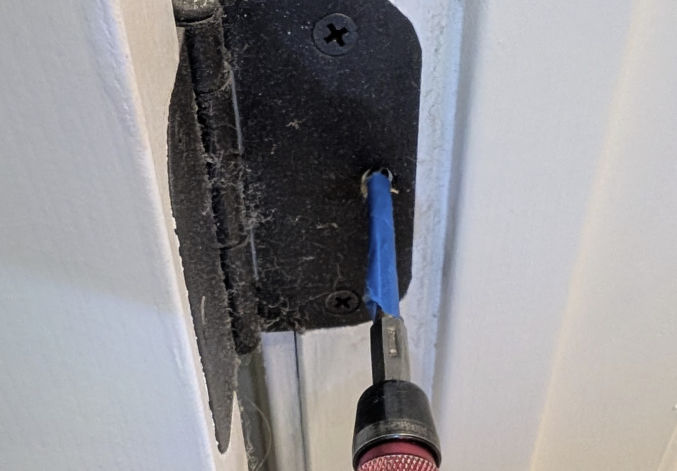
Remove the existing screw and drill into the hole until you reach the tape.
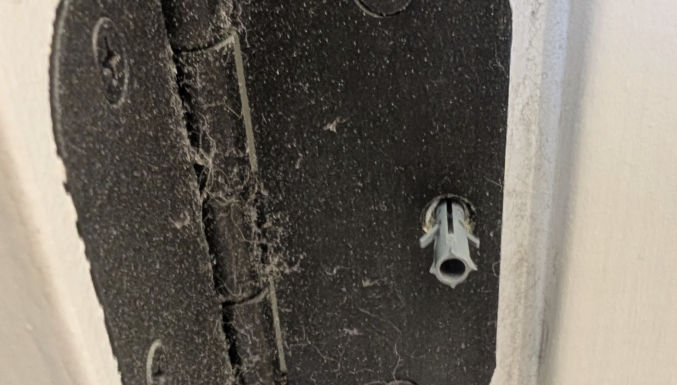
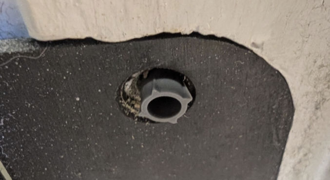
Insert the anchor into the hole.
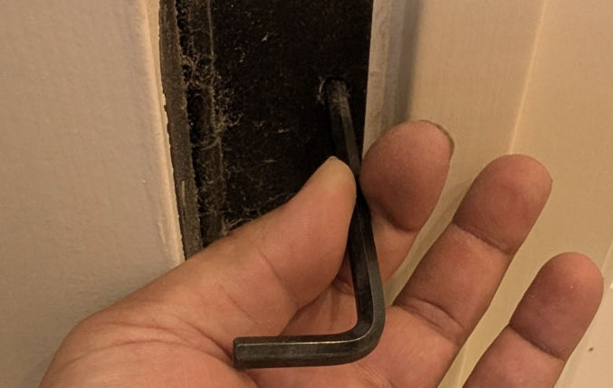
If you can’t insert it all the way into the hole with your hands, hit a hex key against it to push the anchor flush with the hole.
Screw either the existing screw or a #8 x 1-1/2″ screw into the hole. The screw will eventually stop turning when it’s tight.
If you need even stronger door hinges, these Zzem steel anchors may fit the bill.
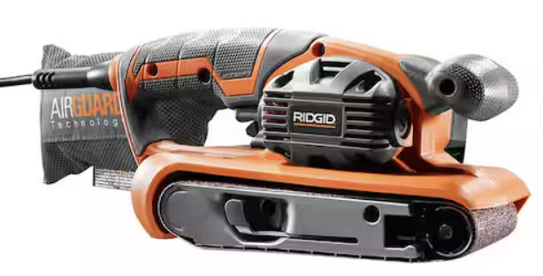
If, after tightening all screws, your door is still slightly hitting the door frame, sand off the protruding part using a belt sander like the one below.
Repainting all the walls and ceilings in your house can really refresh your home and make it appear new and clean. As a landlord of multiple properties, I’ve repainted the interior of entire homes in as little as 6 hours. Here are my tips for whole-house interior painting.
Neutral Paint Color
My go-to paint color is Hazelnut Cream 750C-2 (Eggshell) by Behr (Home Depot). It looks good both during the day and at night and in different light color temperatures.
Same Wall and Ceiling Paint Color
Unless you’re really picky or enjoy spending time masking surfaces and painting, I recommend painting the walls and ceilings the same color. It greatly simplifies the painting process. If you have an MDF baseboard, you can also paint it the same color as your wall. Or, you can paint it pure white, which is the default color.
Masking
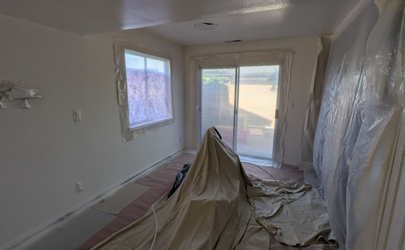
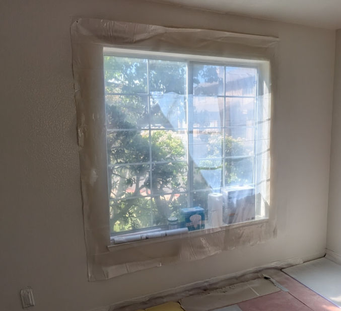
You’ll need to mask areas you don’t want to paint, like windows, ceiling lights, and doors.
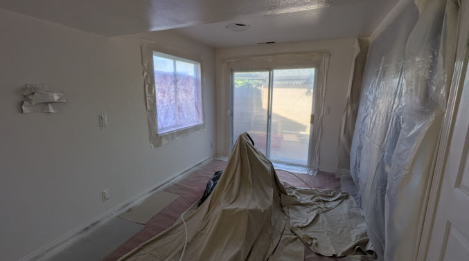
For windows, I like to staple somewhat thick (3.5 mm) transparent plastic. If it’s too thin, it’s harder to cut, it easily blows away, and it’s hard to secure to a surface. Also, stapling is much quicker and easier than taping all sides. The transparent plastic lets light in so you can see what you’re painting. Since the air pressure from spray painting can blow paint particles everywhere, I like to use a healthy margin around any objects I’m masking so that even if paint manages to get under the plastic, it won’t go far and reach the surface I don’t want painted.
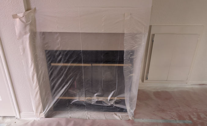
For ceiling lights, I like to staple heavyweight red rosin paper over them, as shown below. Taping is not necessary as long as the paper is large enough to prevent paint particles from reaching the lights from the gaps along the edges. Cutting rosin paper is easy using scissors or a utility knife.
For other surfaces that could fit under one piece of red rosin paper, I’ll use that paper. Otherwise, for surfaces that are too large for the red rosin paper, I’ll use the plastic.
For the floor, I use red rosin paper taped to the top of the baseboard and I’ll use a plastic and fabric drop cloth for the middle of the floor.
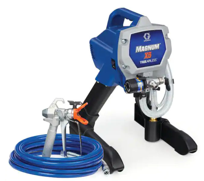
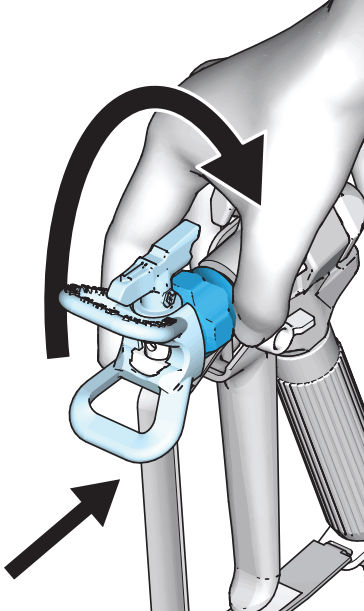
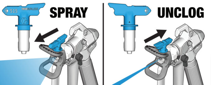
When screwing the spray tip guard assembly to the gun, make sure to only tighten by hand. If you tighten with a wrench, it may be too tight, preventing paint from coming out.
One way to tell if you’ve tightened it too tight is if you are unable to rotate the tip from the spray to the unclog position using your hand.
If you’re having trouble spraying paint, you might need to replace one or more parts, like the spray tip, spray gun and tip, and hose. Start with replacing the spray tip first since it’s cheaper than the other parts.
Clothing
When spray painting, paint particles can go everywhere. You can buy and wear a painter’s coverall, but they are very uncomfortable. Instead, I recommend wearing sacrificial clothing that you don’t mind getting paint on. I wear a long-sleeve shirt with a hoodie so I can cover my arms and hair, leaving only my hands and face exposed to paint particles. If you wear glasses, I also recommend wearing old glasses that you don’t mind getting paint on.
Removing masks
When removing plastic or red rosin paper that was stapled to a surface, I recommend using a staple puller. It makes removing staples and nails much easier than using other methods.
Painting Masked Areas
When you’re done spray painting and removing all masks, you can easily paint any masked surfaces manually using a paint roller.
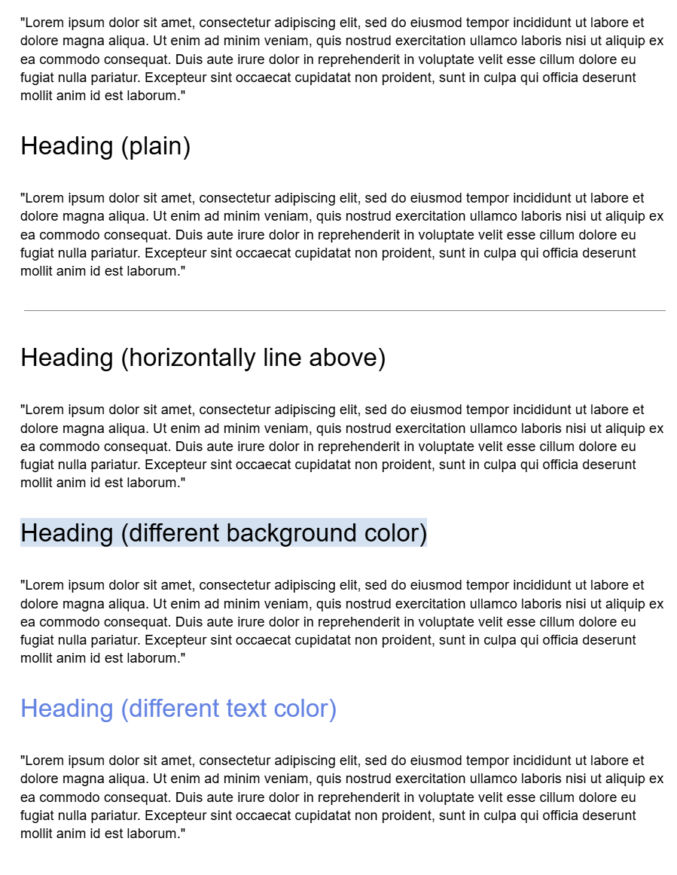
Document headings (Heading 1, Heading 2, …) are useful to show a document’s content hierarchy. But, unless styled, it can still be difficult to visually scan a document to quickly find different sections. Some techniques to add styling and improve visual hierarchy include
using a horizontal line to separate sections
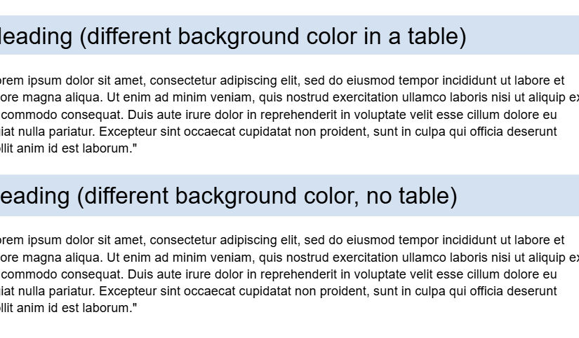
using a background color
changing the heading text color
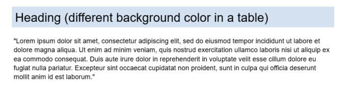
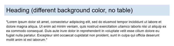
All of these styles, except the one with the different background color, look fine, but they may not suffice if you want high-contrasting section headings. You can put heading text in a 1×1 table, as shown below, but that’s not ideal, especially if your document may be parsed.
To create a table-less heading with full-width background color, do the following:
Type your heading on its own line
Select the entire heading line (triple-click to include whitespace after the text)
Go to Format → Line & paragraph spacing
Click Single
Click Remove space before paragraph
Click Remove space after paragraph
With the line still selected, go to Format → Paragraph styles → Borders and shading
Background color: e.g. #1F2933
Border width:0 pt (all sides)
Paragraph padding: e.g., 6 pt or 7 pt
You can optionally style the heading text and create a reusable heading style (Format → Paragraph styles → Heading 1 → Update “Heading 1” to match).
Here’s a link to the test document used in this post.
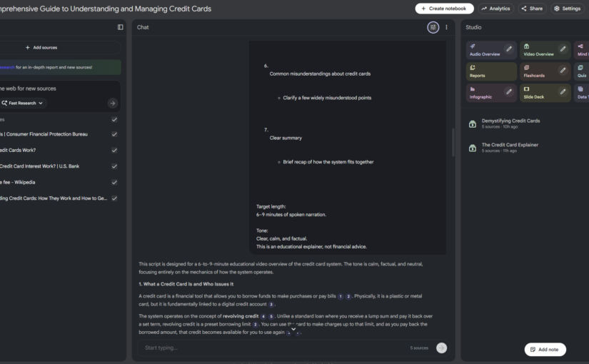
Here’s how I created this overview video in 5 minutes with just a single prompt.
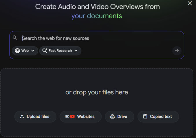
Get Content
Gather the content for the overview video you want to create. The content can be local files (PDFs, text files, etc), copied text, and website URLs. In my case, I got these URLs to pages explaining how credit cards work:
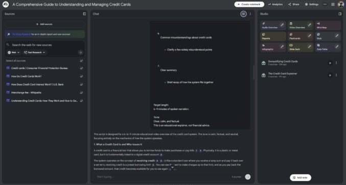
In the left pane of NotebookLM, add your source content.
Add a Prompt
In the middle pane, add a prompt describing what you want NotebookLM to do. In my example, I asked ChatGPT to give me a prompt to tell NotebookLM to generate an overview video of the content in my sources, which I then pasted into NotebookLM.
Generate Overview Video
In the right pane, click “Video Overview” to have NotebookLM generate an overview video based on the content and your prompt. My 4-minute video was generated in a few minutes.