


This is not a “build an app in 10 minutes” post. It’s a realistic guide to using AI coding agents the way you’d use a junior engineer: with specs, guardrails, and review.

In this post, I explain how to vibe code a web app using the following tools:
- ChatGPT Plus/Pro (for planning, strategy, technical architecture, debugging, coding, and explaining everything)
- OpenCode (AI coding agent)
- Agent.md (to guide coding agent)
- OpenRouter (AI coding models, e.g., Claude Opus 4.5, GPT 4.5 Codex, etc)
- Supabase (for PostgreSQL database, if needed)
- Supabase Storage (for file storage, if needed)
- Supabase Auth (for user logins/account management, if needed)
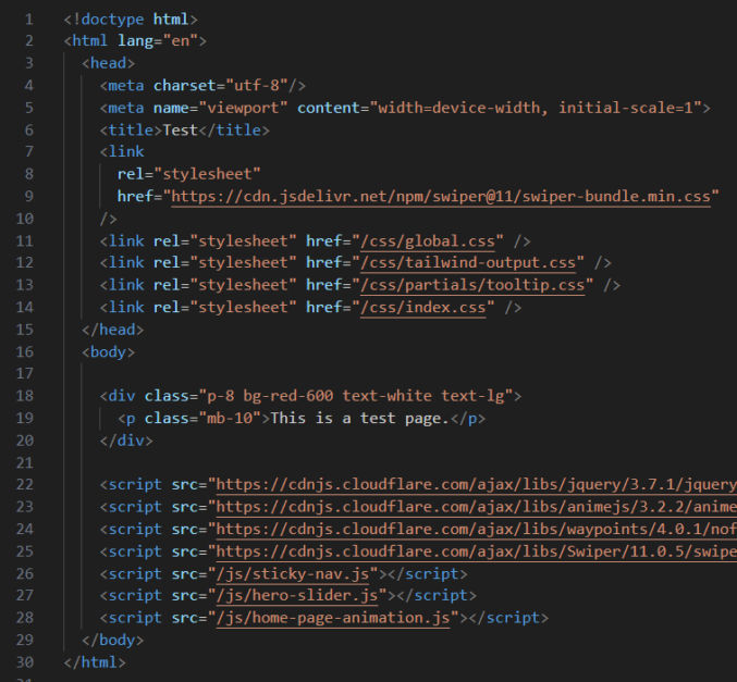
- Statis HTML, CSS, and JS (for front-end)
- Embedded JavaScript (EJS) (for header/footer partials)
- Express.js (for API-based backend)
- express-ejs-layouts (if you want template layout functionality)
- Render.com (for hosting both frontend and backend)
- Stripe (for payments)
- 3rd-party APIs (like kie.ai for text-to-image AI generation)
- VS Code (code editor)
- Resend (send emails using an API)
- Zoho Mail (receive emails)
- ImageKit (image optimization)
Note
You can use Next.js for both front-end and backend code using React and Next.js server actions, but for simplicity, I prefer to use static HTML, CSS, and JS for the front-end and Express.js for the backend. Also, you can use Typescript, but for simplicity, I prefer not to. I think these choices are fine for small apps. They definitely allow for faster vibe coding and simplify the codebase, which reduces the surface area for errors to occur, both during development and in production. If I used Next.js, I would host the app on Vercel, but since I’m not, I will host both the static frontend and Express.js backend/app server on Render.com, which simplifies deployment (push from GitHub, no CORS issues, free plan).
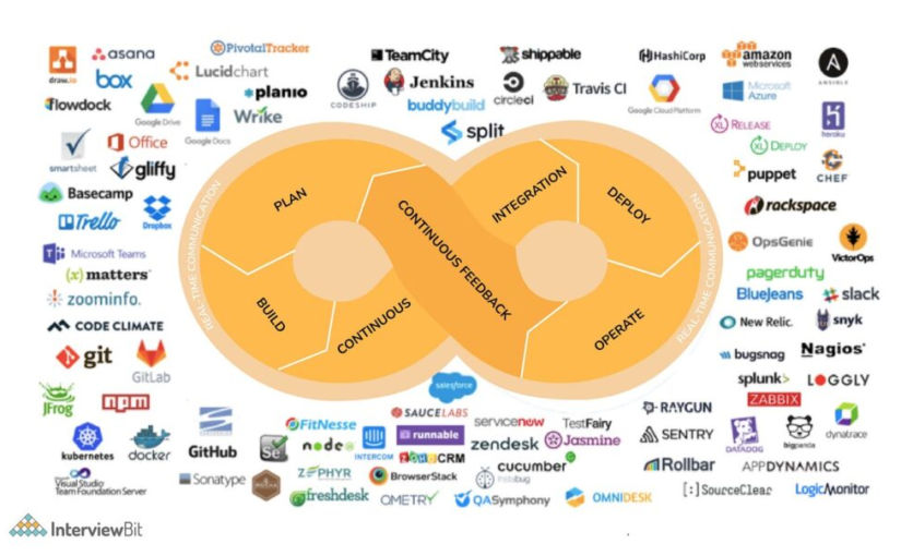
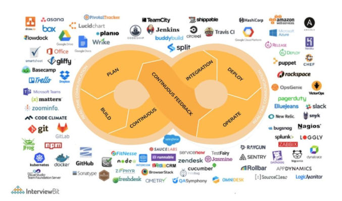
There are many, many, many ways to code/vibe code a web app, including using Claude Code, Cursor, Continue.dev, Gemini Antigravity, Gemini Conductor, and Agent Zero. The approach in this post is just the way I’ve found to work for me for now.
App Idea
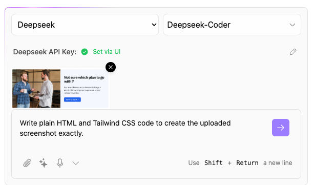
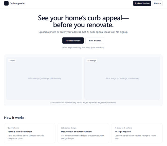
First, you need an app idea. Consult with ChatGPT regarding the business strategy, pros, cons, and anything else you have on your mind. If you are a solopreneur, it’s probably best to keep your app simple enough that you can manage it yourself. For example, you can create an app that lets people upload an image of the front of their home and redesign their curb appeal by changing exterior paint color, yard design, and driveway design using an AI text-to-image generator like Nano Banana Pro.
User Flow & Functionality
Discuss the user flow and app functionality with ChatGPT until you decide on the details that you want for your app.
Tech Stack
Discuss with ChatGPT what tech stack you should have for your app. In my case, I prefer the stack listed above.
UI
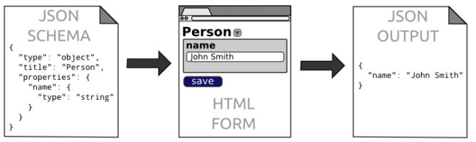
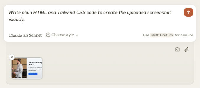
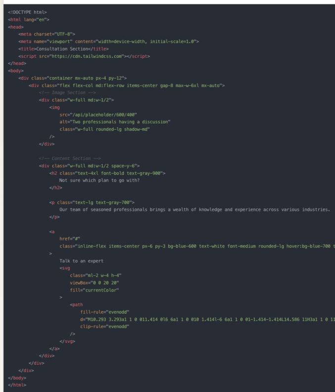
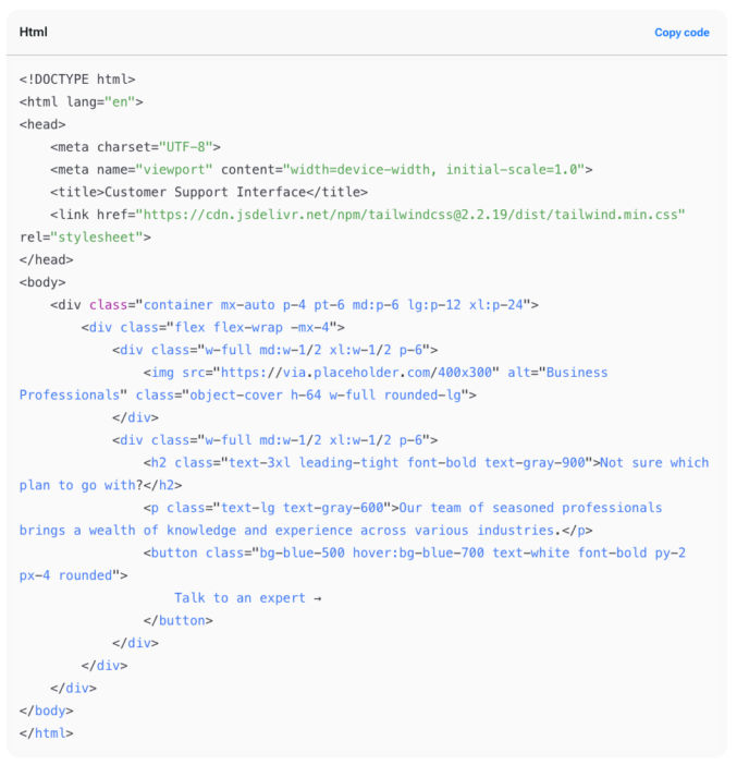
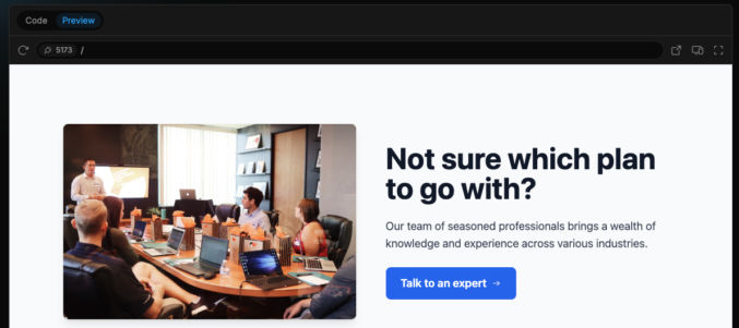
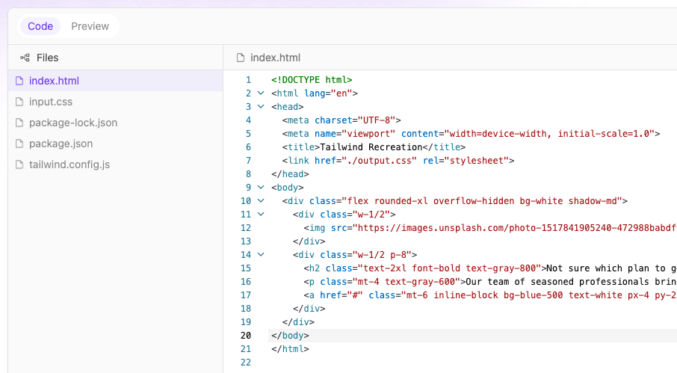
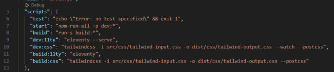
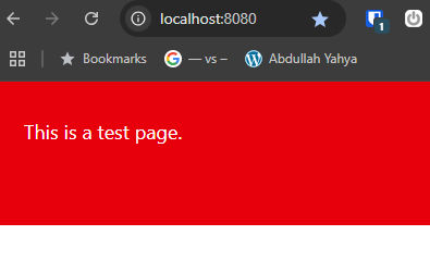
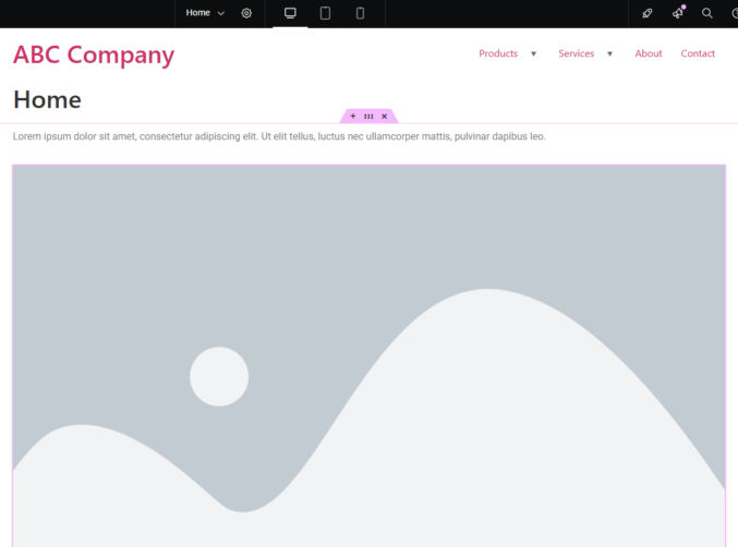
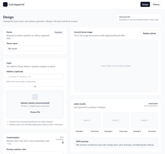
Once you’ve decided on an app idea, ask ChatGPT to give you basic grayscale page designs using shadcn/ui and Tailwind UI components/blocks. You can try to use Google Stitch to generate more polished designs, but if you can’t, just start with a basic grayscale design first. ChatGPT can give you HTML + Tailwind CSS for these designs. For dev purposes only, just use the Tailwind CSS CDN to save time. Here are some example basic designs. Before going live, switch to compiled CSS using Tailwind.
Unique Interactive Elements
To minimize errors and guessing when the AI coding agent codes your app, have ChatGPT update all interactive elements (buttons, links, etc) with unique attributes so that the AI coding agent can uniquely target each element. For example, for buttons, have ChatGPT add a data-action attribution, e.g., <button data-action=”upload-image”…>
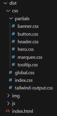
Database
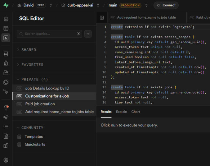
If your project requires a database, ask ChatGPT to propose a database schema. If you agree with the schema, have ChatGPT give you a SQL script to create all tables and constraints. Save the script in a file like 001_init.sql. For the database, I prefer Supabase PostgreSQL for its simplicity.
- Create an account at Supabase.com.
- Create a project
- Click SQL editor
- Paste the SQL script and run it to create the database tables.
File Storage
If you need to store files online, like PDFs or images, there are many options, like AWS S3 and Cloudflare R2 (similar to S3 but cheaper). If you’re already using Supabase for your database, you can just use Supabase Storage to store files.
- Click “Storage”
- Click “New Bucket”
- Enter a bucket name
- Make sure to make the bucket public if your users or app code needs to access files in it
Authentication
Discuss with ChatGPT the best way to handle authentication and user account management. If you need the usual auth with logins, you can use Supabase Auth. But, if you just need a simpler auth mechanism, like using access tokens, you can do that as well. Discuss the pros and cons of each option with ChatGPT and pick one.
Payments
If you will be accepting payments in your web app, you’ll need a payment processor. Everyone seems to use Stripe for this. It has a test mode, which simplifies testing.
Emails
Your app will most likely need to send emails. There are many popular 3rd-party API-based email service providers, including Resend, Postmark, and Mailgun. I personally prefer Resend for its simplicity. For receiving emails, I do not recommend Resend. It’s too complex for that. When you’re starting off and don’t want to spend a lot of money, you can use Zoho Mail for receiving email. Setup was super simple. In my case, I set up an email address in Zoho and forwarded it to my personal Gmail, keeping a copy in Zoho Mail. Then, in Gmail, I added a “Reply as” account so I could reply to emails using my app’s domain, e.g., support@zabuun.com.
Image Optimization
If you use Next.js, it can automatically optimize images for you. If you don’t use Next.js, or if you prefer to separate the image optimization process, there are many options available, including ImageKit, Cloudinary, and TwicPics. I personally prefer ImageKit. You can still host your images in Supabase Storage or S3 and use them as a custom origin in ImageKit.
3rd-party APIs
If you’ll be dependent on external APIs, like a text-to-image generator using Nano Banana Pro, decide on which APIs to use. I’ve been using KIE because the UI is simple and it’s cheaper than fal.
Project Folder
On your computer, create a folder for your project, e.g., curb-appeal-ai. Add the SQL script to it in a folder called “sql”, e.g., curb-appeal-ai/schema/001_init.sql
Environment Variables
Ask ChatGPT for a list of all environment variables you’ll need for the app, e.g.,
- SUPABASE_URL=
- SUPABASE_SERVICE_ROLE_KEY=
- SUPABASE_STORAGE_BUCKET=
- STRIPE_SECRET_KEY=
- STRIPE_WEBHOOK_SECRET=
- KIE_API_KEY=
- KIE_BASE_URL=
- KIE_SUBMIT_PATH=/api/v1/jobs/createTask
- KIE_POLL_PATH_TEMPLATE=/api/v1/jobs/recordInfo?taskId={id}
Create a .env.example file and a .env file in your project folder, create accounts with each 3rd-party provider (Supabase, KIE, Stripe, etc) and add the values for each of the required variables to your .env file (not your .env.example file)
.gitignore
Create a .gitignore file in your project folder and add any files/folders you don’t want to commit, e.g.,
- node_modules
- .env
- .DS_Store
AGENTS.md
Have ChatGPT create an AGENTS.md file in the project folder, following the format at AGENTS.md, containing all the coding guidelines the AI coding agent will need to successfully code the app without any guessing. Ask ChatGPT if any part of the guidelines and initial setup would require the coding agent to guess/infer anything while coding. If ChatGPT says yes, then resolve them now and add any necessary clarifications to AGENTS.md.
Data Formats
Different APIs have different request and response formats. For all APIs you’ll be using, have ChatGPT add each format, e.g., JSON schema, for each API to the AGENTS.md file so the AI coding agent won’t guess what the structure is like.
Logging
Tell ChatGPT to add a logging specification to AGENTS.md so the AI coding agent will log EVERYTHING to the terminal, which will help significantly with debugging.
Initialize your project
- Open your project folder in VS Code
- Open a terminal
- git init
- git add .
- git commit “first commit”
OpenCode
Follow the instructions at OpenCode to install OpenCode. Or, just ask ChatGPT how to install OpenCode.
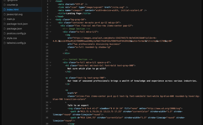
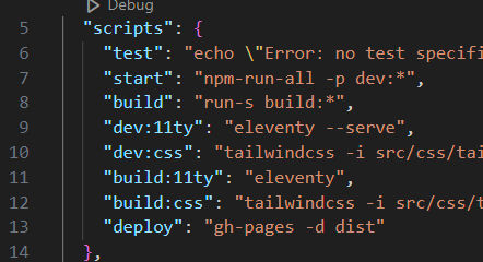
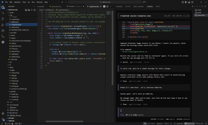
I like to run OpenCode in a VS Code terminal in a separate terminal beside other terminals I use for other purposes, like starting a dev server. In the screenshow below, you can see I have a terminal window for OpenCode and one for Node. I like to have my file explorer on the left, code editor in the middle, and terminals on the right.
AI Model
To use OpenCode, you need to connect to a model. You can use the OpenRouter API with OpenCode to easily switch between models like Claude, Gemini, and GTP Codex. However, you’ll have to buy and pay with credits. A cheaper solution is to use a ChatGPT Plus subscription, which is what I’ve been doing.
OpenCode + OpenRouter
You can use many different AI models with OpenCode, however, you’ll probably want to stick with the best models for web development, which are ranked here. Currently, Claude Opus 4.5 is the best model, but it’s expensive. I’ve been using GPT 5.2 Codex, which is good and cheaper than Opus. Gemini 3 is probably just as good. Instead of creating an account with each LLM provider, it’s easier to just create an account with OpenRouter, which allows you to pay in one place and use a single API key while giving you access to all of the models it supports.
In VS Code,
- open a terminal
- type “opencode” to launch the OpenCode TUI (Terminal User Interface)
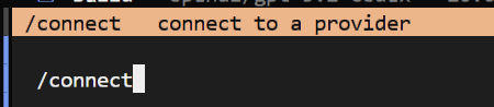
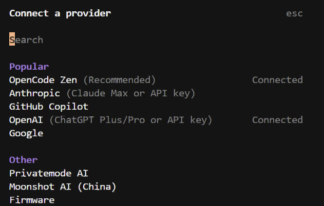
- type “/connect” to connect to an LLM provider
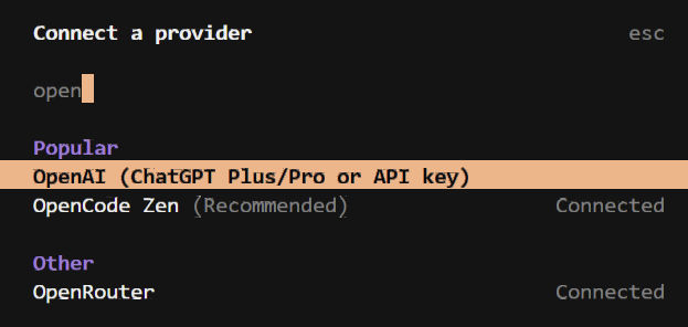
4. type “openrouter” to filter the list and click on “OpenRouter”
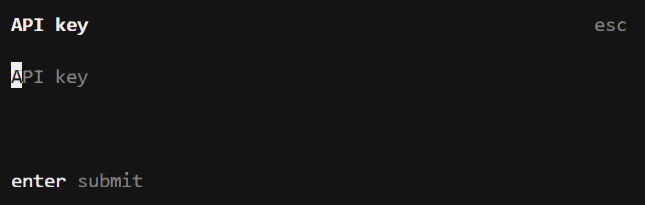
5. Copy/paste your API key from OpenRouter and hit Enter.
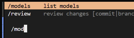
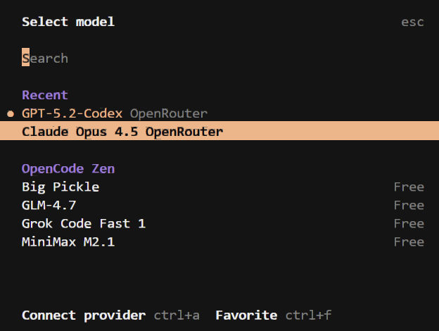
6. type “/models” to view the list of available models
7. Search/browse for the model you want and click on it.
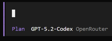
OpenCode has 2 modes: Plan and Build. Click the tab key to switch between modes.
The Plan mode reads your codebase, creates an AGENTS.md file if you don’t already have one, asks questions, and creates a coding plan. It doesn’t modify any files.
The Build mode is for coding.
If you enter a prompt in OpenCode and you get a “User not found” error, then you pasted your API key incorrectly. Re-enter your API key and try again.
OpenCode + ChatGPT Plus/Pro
To connect OpenCode to a ChatGPT Plus web subscription, type /connect to open the “Connect a provider” modal. Search for “OpenAI (ChatGPT Plus/Pro or API key) and click it. A link will appear. Open the link in a browser and log in to your ChatGPT account. That will connect OpenCode to your ChatGPT Plus/Pro web subscription account. I find this to be much cheaper than buying credits.
Plan
Switch to Plan mode by hitting the tab key. Ask ChatGPT to guide you through planning and development. In Plan mode, the agent can’t edit any files. Whenever you start a new OpenCode session, always tell the agent to read through AGENTS.md and, optionally, to audit the codebase. You can say things like
- Read the AGENTS.md file and all files in the repo to get up to speed on what this app is about and what has been done
- Let’s build this app one step at a time following a typical user flow, e.g., 1) sign up, 2) log in, 3) use app, etc
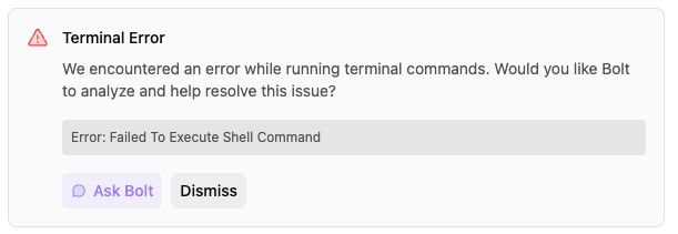
- The “Forgot Password” feature gives an error. See attached screenshot. Please debug and propose a fix.
- Modularize all header and footer HTML into partials using EJS
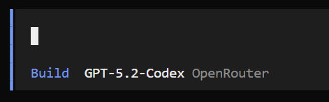
Build
When you are ready to have OpenCode code, switch to the Build mode. You can say things like
- implement the plan you just described in Plan mode
Test & Debug
When OpenCode is done coding, you will need to test your app. I like to follow the following workflow:
- Test functionality in browser
- Switch to Plan mode
- If there’s an error, tell the agent. Optionally include a screenshot.
- The agent explains the error.
- If the error is not related to code, e.g., Supabase config error, the agent tells me what to fix myself.
- If the error is a minor coding error, I’ll just fix it myself.
- If the error is more than a simple one-line fix, I switch to Build mode and have the agent fix the error.
- Once the fix has been made, I test the functionality.
- If functionality is fixed, I switch to Plan mode and ask the agent to give me a commit message.
- I commit the code changes. Otherwise, I repeat from step 3 until the bug is fixed.
- I repeat all steps for all functionality.