


I’ve worked with many graphic designers who were tasked with created web designs. Unfortunately, most designers claimed to know web design when in reality they didn’t. This was obvious when they kept asking me for specific width and height dimensions when I’d ask them for a new hero design. Designing for print is much simpler than designing for web. With print, what you see is what you get because there’s only one size and nothing is interactive. When designing for web, there are numerous factors that must be considered, including SEO impact. In this post, I’ll talk about just one aspect of design that all web designers should understand: grid systems.
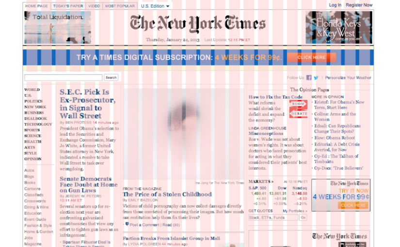
A grid system is just a bunch of columns and, optionally, rows, that help you arrange your design elements. It’s useful for print design, but I’d argue it is essential for web design. In the New York Times screenshot above, you see a bunch of pink columns separate by white gaps (gutters). Notice how the content blocks fit within the columns. Without those columns, your design could end up with a lot of alignment issues, especially when the design contains a lot more than just a bunch of text blocks. Grid systems don’t just make it easier for designers to align content – they also make it easier for developers to develop responsive pages that match the designs they are provided. That’s why CSS has a display option called “grid” and why Bootstrap, one of the most popular CSS frameworks, offers a grid system with sensible defaults.
The most common grid system is the 12-column grid. If you’re a developer, you don’t have to use CSS grid or a premade system like Bootstrap’s grid system – you can use flexbox to lay out your content. But, I personally think it’s better to use a grid for your main layout and just use flex for sub-layouts, e.g., when you’re laying out content within a grid’s cell. This is particularly helpful because your main layout will need to be responsive, and Bootstrap’s grid system already includes code to make your grid responsive automatically. Additionally, if you are part of a dev team, it’ll be easier to update someone else’s code if everyone follows the same coding convention, like using Bootstrap’s grid classes.
If you use Tailwind CSS, you can easily create a grid system using Tailwind CSS classes. However, you’ll have to define your own breakpoints, e.g., on desktop, show 12 columns, but on mobile, show only one.
The easiest way to demonstrate both Bootstrap’s grid system and creating a grid in Tailwind CSS is by example. If you are a developer, the CodePen below should be self-explanatory. Open each CodePen in a separate tab to see the columns on desktop.
Tailwind CSS
See the Pen Tailwind CSS Layouts by Abdullah Yahya (@javanigus) on CodePen.
Bootstrap
See the Pen Untitled by Abdullah Yahya (@javanigus) on CodePen.